Using Upshot data to create Graphs and Charts in Excel
This guide aims to provide some basic hints and tips on how to present data more visually using Microsoft Excel. Nearly all elements of Upshot can be downloaded into Excel and from here you can turn this data into graphs and charts. For more information on the reports on Upshot please click here.
All charts and graphs created can be saved as media and reuploaded to Upshot. These could then be associated with a Project or Attendee to help build reports or case studies.
For some additional guides on helping users analyse their downloaded data, please refer to the
Additional Information section at the end.
Statistics Report
The download of the Statistics Report is a great starting point to create graphs/charts to illustrate the work you have delivered.
The Statistics Report can be Grouped by multiple filters, including key demographics such as Age Group, Gender, Ethnicity as well as filters related to Activities and your own or FO custom data fields.
To find out more about the Statistics Report click
here.
• Go to Reports > Statistics
• Select relevant filters
• Click Get Stats
• Then click Download
This will download your results into a CSV file.
From here you can create multiple types of graphs quickly and easily;
• Highlight two or more columns, usually the text illustrating different Activity names, Locations, Gender etc. and then the column(s) of the values you would like to highlight with the graph.
• Once these have been highlighted select Insert > Recommended Charts
• Choose the relevant type of graph and click Ok
• From here if you would like to make some easy formatting changes to your graph/chart:
o Select your graph and click on Chart Design in the options at the top of the screen.
o There is a tool bar presented at the top of the screen like so:
o Here you can make some easy changes to the colouring and detail of your chart/graph.
o To edit various aspects of the chart, whether that’s the labels, axis or headers there is also the option to right click and select ‘Format . . .’
Here are some examples using the method above:


Examples using 3 Columns
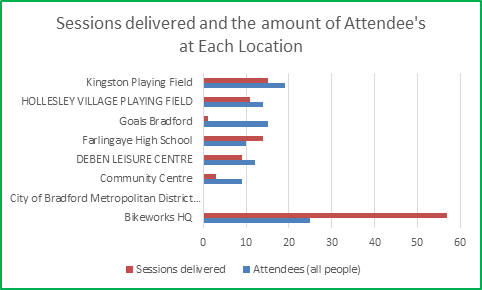
It is important to remember that when adding extra columns/axis into your reports that the graph created is still understandable for your end audience.
Note: All reports can be broken down by time period on Upshot before completing your download. By downloading multiple reports looking at the same reporting criteria you can show a change over time.
People Report
The download of the People Report can be used to create graphs/charts to demonstrate various aspects to the participants you work with. This can be used for more niche criteria in comparison to the Statistics Report.
The People Report can be used to report against the participants on your account using a variety of filters including demographic details, attendance, timeline events, custom fields and more. These filters can be reported on individually or built up to narrow down and find the specific individuals that meet your reporting criteria, which may be useful to illustrate to certain funders.
To find out more about the
People Report click
here.
• Go to Reports > People
• Select relevant filters
• Click Go
• Then click Download
This will download your results into a CSV file.
Note: A more advanced feature on excel called PivotTables can be used to save you time in your analysis. To find out more please click here .
To create charts/graphs it is often important to attach a numeric value to certain criteria.
For example, if you downloaded the People Report and were looking to create a pie chart of the Towns individuals come from, you would need to find the value of how many times individuals came from London, Ipswich or Bradford before trying to create the graph.
In some empty cells list out your different response options, e.g. London, Ipswich, Bradford etc.
You can then enter a formula to find this information from your data set. Enter this formula into the adjacent cell:

• Click on the bottom right hand corner of the cell and drag down into all the other empty cells to copy the formula.
• You will just need to change the end value the formula is searching for, from London to Bawdsey for example.
• Ending up with something similar to below:

This can now be used to create various charts/graphs:
• Highlight the two columns.
• Once these have been highlighted select Insert > Recommended Charts
• Choose the relevant type of graph and click Ok

• From here if you would like to make some easy formatting changes to your graph/chart:
o Select your graph and click on Chart Design in the options at the top of the screen.
o There is a tool bar presented at the top of the screen like so:

o Here you can make some easy changes to the colouring and detail of your chart/graph.
o To edit various aspects of the chart, whether that’s the labels, axis, headers or the graph itself (to add values) there is also the option to right click and select ‘Format’
Examples
Attendance Report
The download of the Attendance Report can be used to create graphs/charts to demonstrate various attendance records for the participants. This can be used for criteria such as Volunteer Time or Amount Paid or for individuals that have attended particular sessions.
To find out more about the
Attendance Report please click
here.
• Go to Reports > Attendance
• Select relevant filters
• Choose the Data to Display ( Volunteer time, Amount Paid)
• Click Go
• Then click Download
This will download your results into a CSV file.
You will then be able to create graphs from this information.
Note I: If you choose to ‘Include Personal Details’ this can also give you additional fields to add to your graphs/charts.
Note II: With the Attendance Report download it can be helpful to remove (or filter) out the rows that show a zero value before looking to create your graph.
Measured Indicators
Measured indicators provide quantifiable metrics that measure the performance of your project in real time. Targets can be set against this, giving you a visual depiction of how your project is performing on the live system.
For more information on
Measured Indicators please click
here.
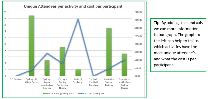
We can create graphs/charts based on the download of the Measured Indicators and what is nice is that there are targets added to this data.
To complete this download:
• Go to your Project
• Click on either By time or By Indicator
• On the right-hand side under Tools click Download Measured Indicators
This can now be used to create various charts/graphs:
• Highlight the two (or more) columns.
• Once these have been highlighted select Insert > Recommended Charts
• Choose the relevant type of graph and click Ok
• From here if you would like to make some easy formatting changes to your graph/chart:
o Select your graph and click on Chart Design in the options at the top of the screen.
o There is a tool bar presented at the top of the screen like so:
o Here you can make some easy changes to the colouring and detail of your chart/graph.
o To edit various aspects of the chart, whether that’s the labels, axis, headers or the graph itself (to add values) there is also the option to right click and select ‘Format’
Home Page Graphs
On the Home Page you have several graphs on the right-hand side of the screen representing overall levels of activity on your account.
This could be Attendances, Sessions Delivered or Contact Hours. These can be viewed either Weekly or Cumulatively.
It is important to note that these can be downloaded directly into a picture format (JPEG, PNG) by clicking on the download icon:

The downloads of these graphs into a CSV file can also be used to produce some visuals.
This can be done by either using the icon as shown above and choosing Spreadsheet.
Alternatively, you can select download data on the right-hand side of the page. Again, this can be done Weekly or Cumulative.
Download week by week data
This presents the attendance for each of your projects on a weekly level.
Highlight the data range and the column with the project attendances to create your graph.
• Once these have been highlighted select Insert > Recommended Charts
• Choose the relevant type of graph and click Ok
• From here if you would like to make some easy formatting changes to your graph/chart:
o Select your graph and click on Chart Design in the options at the top of the screen.
o There is a tool bar presented at the top of the screen like so:
o Here you can make some easy changes to the colouring and detail of your chart/graph.
o To edit various aspects of the chart, whether that’s the labels, axis, headers or the graph itself (to add values) there is also the option to right click and select ‘Format’

Download Cumulative data
Use the same process to download and make your charts/graphs. This time the report will show you a cumulative total of all the work you’ve done.

Survey Results
Surveys can be a really good way of measuring the impact of your work and the difference in individual or a group's behaviour/outlook over time.
Upshot already produces a visual representation of the responses to quantitative questions for a particular deployment already at the bottom of the page.

Further analysis and visualisation of all survey results can come from download results into a CSV file.
This download can be completed by clicking view under the deployment name.

From here under Tools click on Download results.
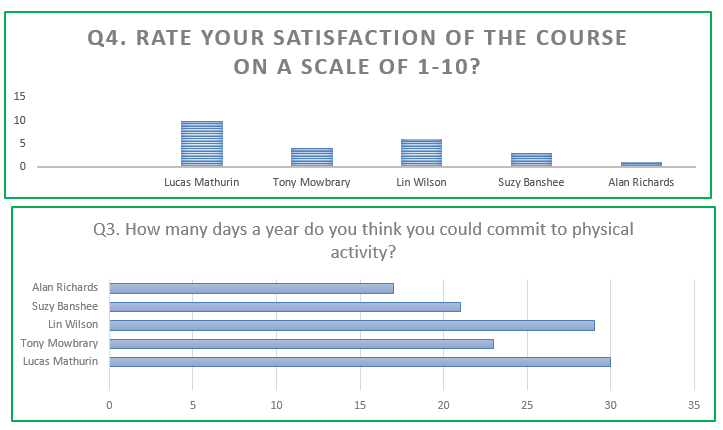
From here you can create multiple types of graphs very quickly and easily for Scale and Whole Number questions.
• Highlight your column(s) including the question title
• If relevant highlight the attendee name column
• Once these have been highlighted select Insert > Recommended Charts
• Choose the relevant type of graph and click Ok
• From here if you would like to make some easy formatting changes to your graph/chart:
o Select your graph and click on Chart Design in the options at the top of the screen.
o There is a tool bar presented at the top of the screen like so:
o Here you can make some easy changes to the colouring and detail of your chart/graph.
o To edit various aspects of the chart, whether that’s the labels, axis or headers there is also the option to right click and select ‘Format . . .’
Here are some examples using the method above:
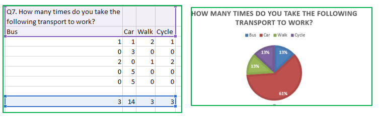
For Count questions it is important to generate some totals of each of the corresponding answers first.
For example, in the download I receive the following information:

I need to create some totals of the amount of times individuals travel by Bus, Car, Walk or Cycle to allow me to compare.
To do this I would use the following formula in a row beneath the cells presented:

Once you have totalled up the scores for your different responses, highlight them, the answer options and the question to create your graph using the steps mentioned earlier.
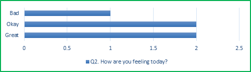
For single and multiple-choice questions to create a graph we must first total up the amount of time each response is stated.
For example, if you had the following set of single choice question responses:

In some empty cells list out your different response options, e.g. Great, Okay, Bad.
You can then enter a formula to find this information from your data set. Enter this formula into the adjacent cell:

• Once used, click on the bottom right-hand corner of the cell and drag down into all the other empty cells to copy the formula.
• You will just need to change the end value the formula is searching for, from Great to Okay for example.
• Ending up with something similar to below:

From here you can highlight these cells (including the numeric value) and the question title to create your graph like so:
For multiple choice questions there is one extra element to the formula.
Initially, your results may be presented like so:

Again, in some empty cells list out your different responses Play football, Play video game, Spend time with family, Spend time with friends.
The formula now needs to recognise every time ‘Play football’ appears even when there might be other text in the cell.

• Once used, click on the bottom right-hand corner of the cell and drag down into all the other empty cells to copy the formula.
• You will just need to change the end value the formula is searching for, from Play Football to Play video game for example.
• Ending up with something like below:

From here you can highlight these cells (including the numeric value) and the question title to create your graph/chart as before.
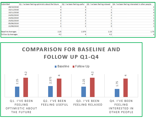
Creating averages is also a powerful tool when looking at scale questions, count or whole number answers.
To find the average of a set of cells use the formula listed below:

• Once used, click on the bottom right-hand corner of the cell and drag down into all the other necessary cells to copy the formula.
• This can give you the average response to each question for a Baseline deployment for example for the Warwick-Edinburgh Scale as shown in the example below:

- Averages are powerful when used in the comparison of survey results. Separating sets of deployment responses and then placing the averages next to each other can create a powerful graph to show the difference in a collective response between Baseline and Follow Up.
Note: Additional tools such as PivotTables can be helpful in your analysis of survey results, to find out more please click here. In other instances, you may want to combine your Survey export with participant information this can be done by using the 'download results (including personal details) option.
Comparing surveys
It is worth noting that the system will already present a comparison of the results after selecting the compare button.

To find out more about
Comparing Surveys please click
here.
Note the comparison will only work for individuals that have submitted results in both deployments (i.e. Baseline and Follow Up).
Further analysis and visualisation of the comparison results can come from downloading results into a CSV file.
After you have clicked compare for the relevant two deployments on the right-hand side under Tools will be the option to Download results.
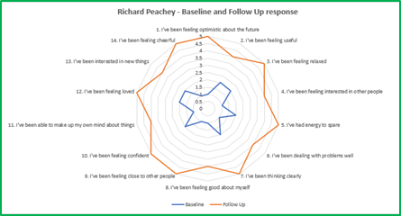
The download of these results will feature a question by question breakdown, but lower down the spreadsheet you will be presented with the list of individuals' responses.
This offers you the chance to show in a nice visual way the change in an individual’s response between two different deployments.
This works for scale and whole number questions.
Highlight the questions and the first survey and second survey response like so:

• Once these have been highlighted select Insert > Recommended Charts
• Choose the relevant type of graph and click Ok
• From here if you would like to make some easy formatting changes to your graph/chart:
o Select your graph and click on Chart Design in the options at the top of the screen.
o There is a tool bar presented at the top of the screen like so:
o Here you can make some easy changes to the colouring and detail of your chart/graph.
o To edit various aspects of the chart, whether that’s the labels, axis or headers there is usually the option to right click and select ‘ Format . . .’
These images could be saved as pictures and re-uploaded to your Upshot account as media associated with the attendee. This helps when producing a case study for example.
Additional Information
To further aid your analysis and potentially save time users may find the following additional guides of interest.
PivotTables can help summarise data from the People Report quickly and give you the numbers and % of the participants that meet certain criteria. This can also be helpful in analysing the breakdown of your Survey export. To find out more please click here.
(Note this guide was created using Microsoft Excel 2016 MSO (16.0.7329.1017) (64-bit)


