On Upshot PivotTables can be particularly useful for exported data related to the People Report, Survey Results and the Database Table format of the Attendance Report.
• Click on this area (as shown below) to work with the PivotTable report.
• When clicked on you will have the PivotTable Fields box presented on the right-hand side of the page to allow you to choose which Fields (column headers) you would like to report on. Here you have the option to click and drag the fields to either be Filters, Columns, Rows or the Values presented from your data.
• If you simply want to report on the data for one field the easiest option can be to add this field to the Rows and Values column.
• In the example below you can see the PivotTable fields chosen and the results initially presented.
• In the below example I am looking for the Number of Participants that come from each Constituency.
Adding Fields to both Rows and Columns
Where this report can become more powerful (and flexible) is by adding an additional field option to the Columns as well.
This then adds objective criteria to break down our initial results for Constituency further.
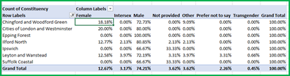
For example, I can now look for the Number of Participants that come from each Constituency, broken down by Gender.
I can find this by adding Gender to my Columns like so:


By changing the Value Field Settings to show this as a % of Grand total I can tell several things, for example:
1.12.67% of my participants overall are Female
2.0.90% of my participants overall are Female + come from Chingford and Woodford Green
If I change the Value Field Settings to show as a % of Column total I can now see that 7.14% of all Females come from Chingford and Woodford Green.

Or if I choose to show as % of Row Total I can now see that of all the participants that come from Chingford and Woodford Green, 18.18% of these are female.
Multiple Fields can also be added to the Rows/Columns to breakdown your results further.
Filters
Fields can be added to Filters in addition/instead of the options presented under Rows and Columns.
For example, if Constituency was a filter instead of Rows in the example above the data would look like so:

Using the Filter highlighted above can allow you to choose whether the values shown for Gender are for all Constituencies or certain ones.
Adding Filters in addition to Rows and Columns though can be extremely powerful. If I add a filter such as Age I would then be able to see the following:

I could then use my filter to show the results for People of a certain Age or multiple ages at once.
PivotCharts
Displaying the data from your PivotTable can be done by using a PivotChart.
When you have selected a cell within your PivotTable you will have the option to select PivotChart.

This provides me with prepopulated graphs from my data set. I can then format the chart to produce something similar to the one shown below.
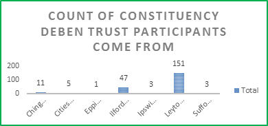
Top Tip: Sorting your data into descending/ascending order can make your Column Charts more striking. For additional tips on formatting excel graphs and charts please click here .
You can also apply this to PivotTables with multiple fields. Once the PivotChart is created there will be options, on the chart, to filter the options presented, allowing you to adapt your graph when necessary.
Always be mindful of your audience when creating charts with multiple criteria to make sure it is easy enough to understand.
People Report
The People Report can be used to report against the participants on your account using a variety of filters including demographic details, attendance, timeline events, custom fields and more.
These filters can be reported on individually or built up to narrow down and find the specific individuals that meet your reporting criteria, which may be useful to illustrate to certain funders.
When you have run the report, you have the option to Download. This data comes out in a excel CSV format and from here you can create your PivotTable.
The People report is used for the examples used from page 2.
The recommended field types to use in your PivotTable would be Single-choice fields.
Survey Export
PivotTables can also be helpful for analysing Survey results. Downloaded survey results from Upshot export into Microsoft Excel.
The recommended survey response to use in your PivotTable, would again be single-choice field responses.
You can do this for one question and get % and charts like so:

But where this can become more powerful is using criteria in both the Rows and Columns.
This would allow you to analyse the amount of people that answered a particular question in a certain way and then breakdown how they responded to another question.
Please see the following examples below:
Example 1
‘Q2. I can achieve most of the goals I set myself’ cross referenced with ‘Q5. I’ve been feeling useful’

So, I now know that 50% of the people who answered ‘All of the Time’ to Q5 ‘I’ve been feeling useful’ answered ‘Strongly Agree’ to Q2 ‘I can achieve most of the goals I set myself’.
In this example I have chosen to Show the Values as a % of Row total.
Example 2
‘Q2. I can achieve most of the goals I set myself’ cross referenced with ‘ Q3. To what extent do you agree or disagree that most people in your local area can be trusted.’

By showing the values as a % of Grand total I can see that 25% of people answered Strongly Agree to both questions.
Whereas 8.33% of people Strongly disagreed that they ‘ (Q2) Can achieve most of the goals I set myself’ & answered that they Strongly Agreed that ‘ (Q3) People in your local area can be trusted.’
Combining People Report and Survey Results with PivotTables
For Standard surveys, users can download their survey responses and choose to include attendees' personal details in their export, combining both the Survey and People Report exports. This can enable users to break down their survey responses via demographic details such as Age, Gender and Ethnicity etc.
This can be very helpful in seeing if responses differ due to where people’s different demographic information and can give a powerful insight into where to focus or modify your delivery going forward.
Example: ‘Q10. I’ve been able to make up my own mind about things’ and 'Ward'

I can now tell that of the survey responses completed by individuals from Ilford North, 50% of them respond with ‘Often’ to ‘I’ve been able to make up my own mind about things.’
Whereas for Ilford North and Leyton and Wanstead combined, only 16.67% of these individuals answer ‘All of the time’ to this question.
In addition, no respondents from Leyton and Wanstead put ‘Rarely’ in response to this question whereas 50% of respondents from Ilford North gave this response.
I can then consider internally what is it I am doing with the individuals from Leyton and Wanstead that I am not doing with the participants from Ilford North.
Attendance Report - Database Table download
For more information on using PivotTables with the database table download of the Attendance Report please see the below video and guide
here.
( Note the examples in this guide were created using Microsoft Excel 2016 MSO (16.0.7329.1017) (64-bit)


